
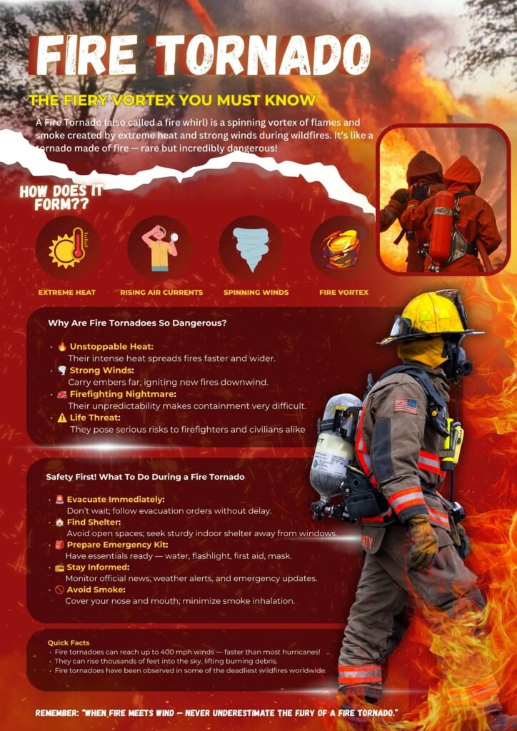
I created the infographic titled “FIRE TORNADO” as a major requirement for an environmental science or disaster risk reduction and management (DRRM) assignment. Our instructor tasked us with selecting a rare yet devastating natural phenomenon and creating an informative public safety poster about it. I chose fire tornadoes because they perfectly illustrate the dangerous intersection of extreme weather and wildfire dynamics, making it a compelling subject for a disaster awareness campaign.
My primary goal with this layout was to break down a complex meteorological event into an easy-to-understand visual guide for the general public. I started by using sequential, minimalist icons to illustrate the exact formation process—from extreme heat to the final fire vortex. By structuring the text into distinct sections detailing why these events are dangerous and what safety protocols to follow, I wanted to ensure the graphic serves a practical, life-saving purpose rather than just being a collection of facts.
To capture the intense and dangerous nature of the subject, I went with a bold, fiery color palette dominated by deep reds, vibrant oranges, and striking yellows. I used a dramatic torn-paper effect near the top to separate the introduction from the core data, and I integrated high-quality action shots of firefighters to emphasize the real-world bravery required to face these hazards. Placing the large cut-out of a firefighter on the right side helps anchor the design and draws the viewer’s eye down through the safety tips.
Ultimately, I included a “Quick Facts” section and a powerful closing reminder at the bottom to leave a lasting impression on the reader. Through this project, I wanted to demonstrate to my professor that I could effectively blend scientific research with practical disaster preparedness protocols. At the same time, it allowed me to push my digital design skills by balancing intense graphics with highly readable typography and a clear informational hierarchy.